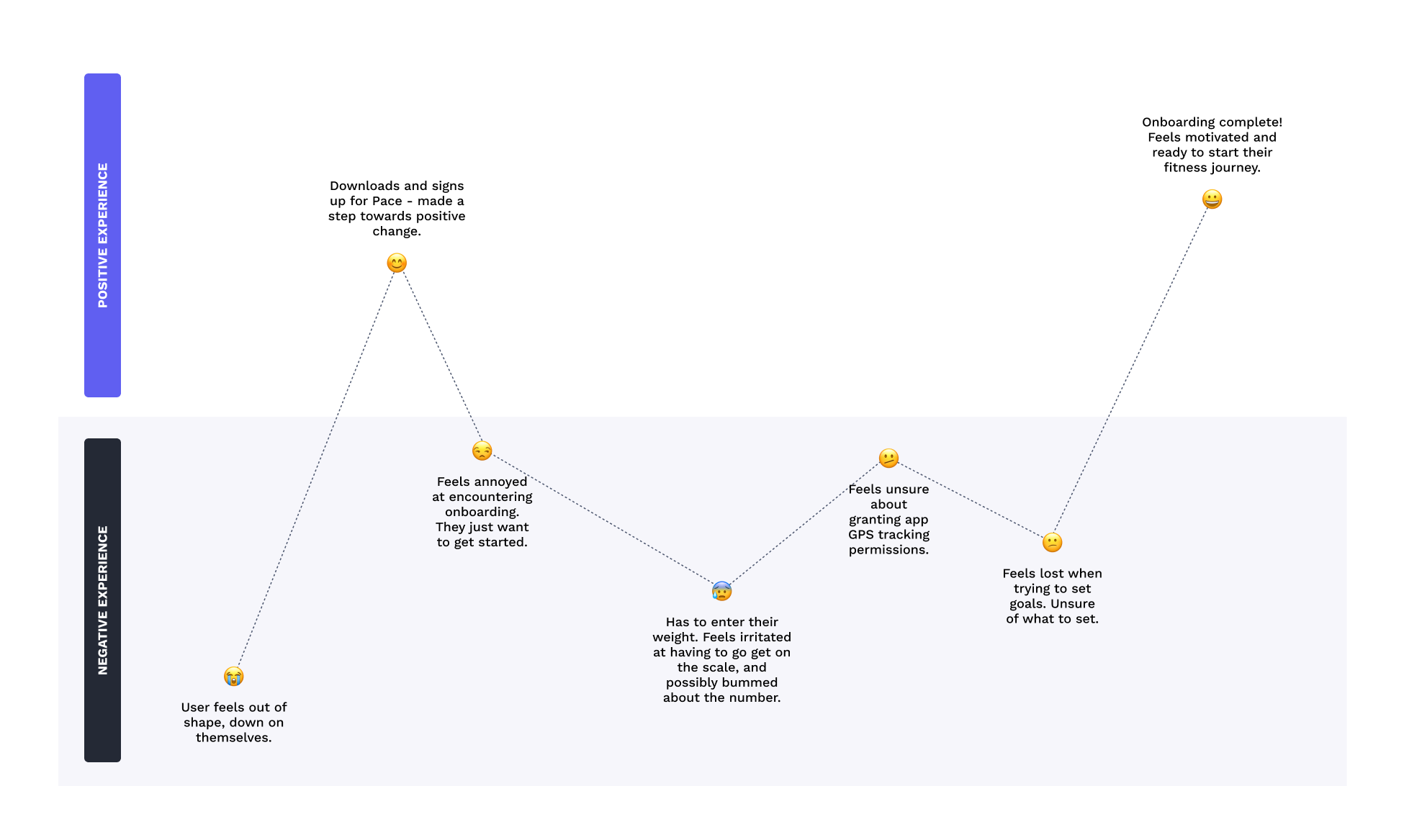
A user journey mapping positive and negative emotions associated with onboarding.
Content Design
In this student project, I created an onboarding flow to get users started with Pace. I wrote UX copy and created wireframes.
I worked on this project alone, focusing on UX writing.
A few days.
Pace is a goal-tracking exercise app. It lets users set goals, track progress, rate workouts, and more. I was tasked with creating an onboarding flow which the user encounters after signup.
Onboarding needed to accomplish the following:
I chose a friendly, encouraging brand voice. Since it's an exercise app, I wanted to set a motivational, welcoming, judgement-free tone.
I also created a user journey to map out some possible pain points. In this journey, I acknowledge that onboarding may cause some friction. Setting weight, for example, may be troublesome: the user might heavier than they'd like to be, or simply annoyed about having to walk to the bathroom and get on the scale.

A user journey mapping positive and negative emotions associated with onboarding.
While creating this flow, I tried to mitigate the possible pain points I identified. I also wanted to create something engaging and pleasant to use to encourage completion.
First, I tackled the welcome screen. I used this as an opportunity to establish a friendly, welcoming brand voice. I also included a playful branding moment by playing on the app's name.
The user would have provided their name during signup. I repeat it here to welcome them in and establish rapport.

The welcome screen.
Next, I wrote screens to collect height and weight data.
I made sure to approach this screen with empathy. Recording your weight can be negative for some people, so I made sure to explain why we needed this information. It can also be a pain in the butt—if the user hadn’t weighed themself in a while, they would need to interrupt the onboarding process to go find a scale to get on. So I made sure to let them know that their best guess was fine for this purpose by adding the following copy: "An estimate is fine. You can update this later."

Collecting height and weight info.
I wanted goal setting to feel simple and intuitive. In my solution, users can select their preferred variables to complete the sentence "Mad Libs" style.
The goal uses 10,000 steps daily as a placeholder. This is a common activity goal—particularly amongst people who are new to or restarting their fitness journey. Using a pre-filled goal on the screen decreases mental load, since some users may not have a specific goal in mind besides getting more active or losing weight.

Setting a goal, "Mad Libs" style.
For the location tracking opt-in, I made sure to explain why the app wants access to this info, since it amy feel invasive to some.

Finally, onboarding is complete. The final screen includes a small moment of celebration with the user for getting through it. I also made sure to remind them that they can always go in and change their details in the settings.

You can see a walkthrough of the entire onboarding flow in the gif below.
