Before: two separate landing pages, one for mentees and one for mentors.


Content Design
Thrive Out Loud needed a landing page. As a new mentorship platform, it needed to drive sign ups and grow its user base. I crafted homepage content with this in mind.
As the content designer and UX writer, I was solely responsible for page's content. I strategized, wrote copy, created wireframes, and collaborated with our design team.
1 week.
Thrive Out Loud is a mentorship platform that aims to connect queer young adults with LGBTQ+ career mentors. As a new platform, its primary goal for its homepage was to convert sign ups.
I was building off of existing assets which needed to be updated to reflect changing organizational priorities. A choice had been made to separate the platform its parent charity, moving from "Sean's Legacy Mentorship Platform" to "Thrive Out Loud". The focus was also narrowing to serve a 100% LGBTQ+ and 100% professional user group (previously, it was open to students and allies). Information architecture changes also saw us moving from two separate landing pages (one for mentors, one for mentees) to a unified homepage.
Contextual note: Thrive Out Loud is a Tech Fleet project. Tech Fleet is a not-for-profit dedicated to creating opportunities for people to gain real-world tech experience. They partner with other not-for-profits seeking tech solutions and put together teams of volunteers to deliver them. I joined Thrive Out Loud during the project’s fourth phase.
Before: two separate landing pages, one for mentees and one for mentors.
The homepage needed to:
Past user research was available, providing target audience insights:
To understand the user journeys, I spoke with internal stakeholders. I learned that mentors were being actively recruited, but mentee outreach was limited. This meant that mentees would land on the homepage much earlier in their journey than mentors. For them, the website might be their first touch point with Thrive Out Loud.
To inform word choice moving forward, search-word analytics was conducted. Previously, the platformed used "LGBTQIA+" and "queer" to refer to its community. New research pointed towards “queer” and “LGBTQ+” as the most commonly used and understood terms.
When updating the content, I looked for ways to improve scannability, reduce cognative load, and get users from A to B faster. Respect is a key pillar of the brand voice. It was important to be respectful of the user's time.
I had to decide who to talk to first: mentors or mentees. Based on the different user journeys I learned about during discovery, mentees were chosen as the priority. As a group, they're less familiar with the platform and more likely to need guidance and information about what's being offered.
Finally, I pulled on the available user insights to reframe benefits that would speak to both user groups.
Here, a strong contextualizing headline works to orient visitors. What Thrive Out Loud is all about is quickly made clear.
While copy here is relevant to both user groups, it is a bit more focused on the prioritized user group: mentees.
Eligibility is established immediately to avoid wasting anyone's time.
Finally, a single CTA above the fold drives sign ups. This brings users to a page that branches mentees and mentors to the correct sign up flows.
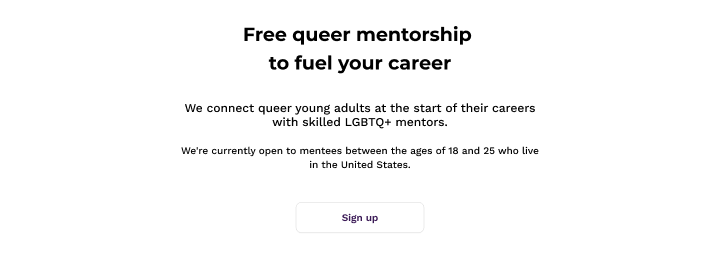
The header section of the homepage.
Next, three product benefits are shown to further establish the platform's value.
These benefits speak to both user groups. They align with user values according to our research.
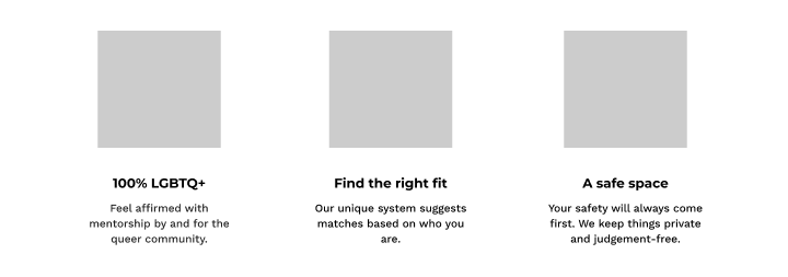
Three product benefits are highlighted.
Here, the site speaks directly to mentees. An easily scannable subhead is used to make it clear who is being spoken to. The body copy speaks to what mentees value. Eligibility is repeated.
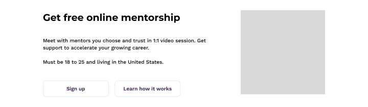
A subsection that speaks directly to mentees.
Here, the site speaks directly to mentors. As in the previous section, an easily scannable subhead is used to make it clear who is being spoken to. The body copy speaks to what mentors value.

A subsection that speaks directly to mentors.
Finally, I added a new footer sentence to connect Thrive Out Loud to its parent charity, Sean's Legacy.

The final sentence that links to Sean's Legacy.

The designed homepage.
Research indicated the homepage successfully appeals to the target audience. They particularly resonated with the platform being 100% LGBTQ+ and liked the way it was called out.