
A sample question from the onboarding flow, which collects data on things like the user's sexual, gender, and ethnic identities.
Content Design
Thrive Out Loud needed to make sure its users were correctly filling out their profiles. Our team created a system of dynamic prompts to guide them through the process.
I worked as the UX writing team lead with two other UX writers. This case study was written in partnership with one of them, the fantastic Marissa Goodman.
3 weeks.
A short timeline / uneven project history / working in a volunteer setting / lack of capacity for input from the design team / lack of over-arching project oversight.
Thrive Out Loud is a Tech Fleet project. Tech Fleet is a not-for-profit dedicated to creating opportunities for people to gain real-world tech experience. They partner with other not-for-profits seeking tech solutions and put together teams of volunteers to deliver them. I joined Thrive Out Loud during the project’s fourth phase.
Thrive Out Loud is a LGBTQ+ professional mentorship platform. It prioritizes creating a safe, inclusive space where mentees can create meaningful connections with mentors like them.
A matching system suggests connections based on compatibility. It pulls from data points including professional backgrounds and personal details like sexual, gender, and ethnic identities. Users answer a questionnaire during sign up to provide this information.
A sample question from the onboarding flow, which collects data on things like the user's sexual, gender, and ethnic identities.
This data also appears on their profiles. It sits alongside other information, like long-form bios, that the user inputs after sign-up.
Navigating users through completing their profiles proved to be a challenge. How should the information they provided during sign up be balanced with the new content they would be asked to add? How could we ensure users understood info had been pulled from onboarding? How could we make it sure that there were more sections to fill out?
Past user research was available, providing target audience insights:
Privacy, safety, and control were identified as important when it came to user's personal information.
We also looked at other profile creators, like from ADP List and LinkedIn, to understand common patterns.
Based on user research, we knew we had to prioritize the user's sense of safety. This meant that the user would understand how their information was being shared with others on the platform. Ensuring the user knew what their profile looked like to others became important.
When a new user arrives on their profile for the first time, they see the draft profile the app has compiled for them based on their onboarding answers. We needed to find a way for them to understand that their profile still needs to be edited, and is not yet viewable to the public at this stage.
Our first approach to addressing this was exploring “preview”, “publish” and “edit” CTAs.

CTA exploration: draft mode, with preview and publish CTAs.

CTA exploration: preview mode, with edit and publish CTAs.
We quickly ran into the issues with this approach. The profile design makes use of editing pop up modals, each of which has a “save” CTA. In pressing this “save” CTA, the user could reasonably expect that their edits be permanently saved. The addition of a “publish” button complicated this, possibly resulting in lost edits.

Users add content to their profile with pop up modals, which include a "Save" button.
So, we pushed to find a simpler solution.
We conducted a competitive analysis to understand how similar platforms guide their users. LinkedIn uses editing modals, like we do, without requiring any additional action from users beyond clicking the edit icon on a section. ADP List also uses an editing modal, along with an ‘edit profile’ CTA at the top. Both approaches had a simplicity we wanted to incorporate into our design. We concluded that a “Publish” button would add unnecessary complication.

Left: LinkedIn profile editing modal; Right: ADPList profile editing modal
After careful thought, we landed on a new solution: a temporary banner at the top of the page. The banner contextualizes the “Publish” CTA, and provides an opportunity to communicate with the user about the draft status of their profile.

The banner we introduced, displayed at the top of new, draft profiles. It includes a "Publish" button and an explanation of the profile's status.
This banner ensures our users clearly understand the status of their profile, and what they should do next. It introduces a little bit of positive friction, making sure our users stop and review what's been generated for them. This, in turn, reinforces a sense of safety, ensuring the user feels in control of their information.
The “publish” banner we introduced does a lot of heaving lifting in inviting users to add to their profile. However, we still needed to find the right way to guide the user through the next steps. Whatever solution we landed on would need to balance the two types of profile content:
In the beginning, we tried displaying the empty supplementary content buckets in-line with the pre-filled ones. Placeholder copy was used to prompt the user to fill them out. This approach relied mostly on visual clues to separate the types of content.

An example of an earlier solution, which used placeholder copy and visual cues to indicate the empty “Interests” section.
We quickly realized that this approach wasn’t working. Some quick user testing taught us that it simply wasn’t clear enough. Users found it confusing; they failed to quickly understand that the section highlighted in purple was a new content bucket that they could add to.
The solution above also created what we came to think of as “the preview problem”: a logged in user would see the empty sections on their own profile; every other user would not. This made it difficult for users to see an accurate preview of their public profile, which was one of our guardrails.
So we went back to the drawing board, asking ourselves how we might clearly prompt the user to fill empty sections while giving them an approximation of their public profile.
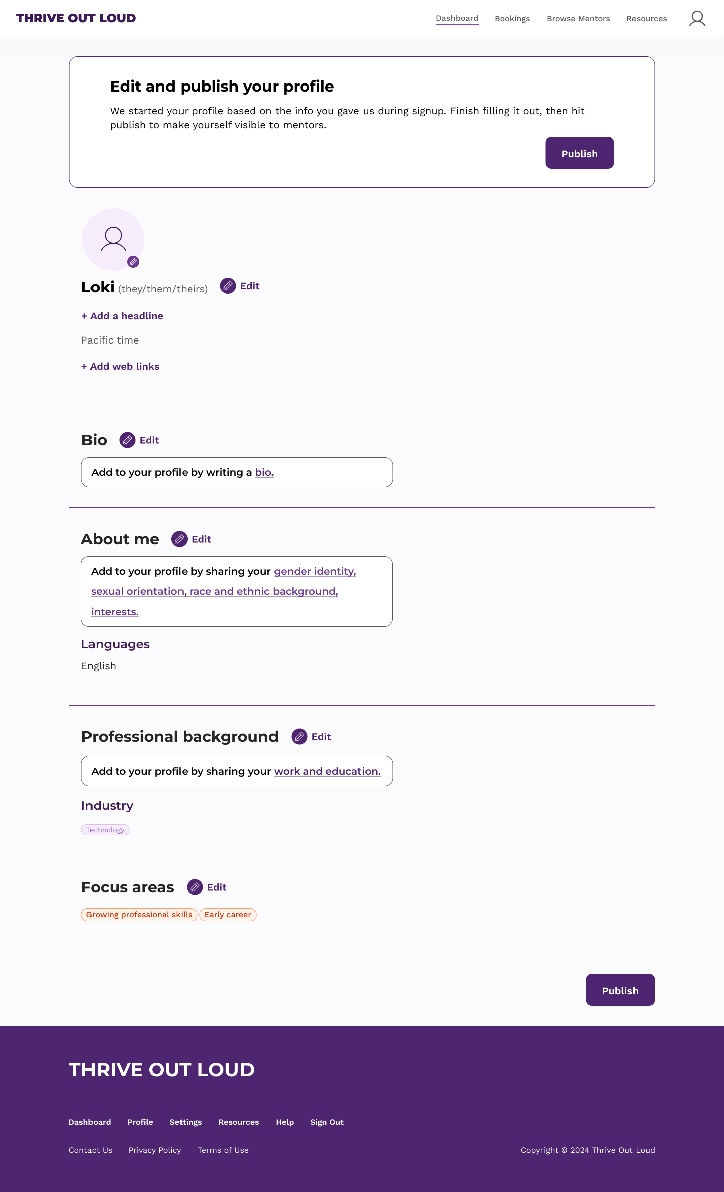
Ultimately, we landed on a more content-driven approach. We implemented clear, language-based prompts that speak directly to the user, telling them in plain language that there are additional sections they can fill out. For example, “Add to your profile by sharing your interests.” These prompts are displayed in small banners at the top of each profile section, rather than in-line with the profile content.
The prompts are dynamic, changing depending on which content buckets are empty. In the About me section shown in the example below, you can see the prompt cycling through various versions, changing to include gender identity, sexual orientation, race and ethnic background, and interests, depending on what info the user has provided. (Note: some of this—gender identity, sexual orientation, race and ethnic background—is onboarding information, but could still appear here if the user chose “Prefer not to respond” while signing up.)

A prompt box at the top of each section dynamically reflects empty sections in the user’s profile. Empty sections are not displayed.
Importantly, empty content buckets are not displayed with this solution. Placeholders are no longer necessary. This gives the user a much closer approximation of their public profile. With the exception of the prompt banner, they see what others see.
The banner, publish button, and dynamic prompts work in tandem to create a thoughtful and intuitive user experience that is centered on creating a safe space for Thrive Out Loud users. They can confidently and easily complete and publish their profiles, knowing exactly what information is being shared and when. It is also easy for the user to understand how their profile will look to others, and what additional content buckets they have the opportunity to fill out.
Coming into a project in the middle can drastically impact the way you think about it. You take the logic the project is built upon for granted, assuming it’s sound.
However, after thinking deeply about the relationship between onboarding, the matching system, and the profiles, I’ve concluded that the existing structure is perhaps needlessly complicated. If I could do it all again, knowing what I know now, I would suggest scrapping the onboarding questions altogether. A simpler, more elegant solution would be to allow users to sign up with a quick account creation, then use the profiles to collect matching data.
This would make it faster and easier to sign up. It would also eliminate the need for pre-filled draft profiles and the dynamic prompts and banners we engineered as a solution to explain them. It would likely also make development faster and easier, as it would reduce the amount of screens that need to be developed and maintained.
In short, we spent a lot of time finding a solution for a problem that could have been eliminated altogether.
That being said, given our short timeline and the reality of coming into the project midway through, I believe we did the best we could with our circumstances. The solutions we implemented address all of our goals and provide a clear, intuitive user experience.